Chaos and Planning
This article ran first in Vancouver Review. Sadly, I have to report that the Red Gate did finally lose its battle with the city and has been evicted.
CHAOS AND PLANNING: A tour of Vancouver’s public art
Peacable Kingdom detail
ONE: THE RED GATE
By the time you read this article, an interesting but little-known Vancouver public-art institution will either have dodged a bullet or bit the dust. I’m talking about the Red Gate. And because of the timing here, I don’t know if I’m talking about it in celebratory or funereal tones.
Sometimes referred to as the “Rainbow Art Institute,” the Red Gate is (was?) a non-profit art and music space run by Jim Carrico in the 100 block of West Hastings Street in a rapidly developing part of Vancouver’s Downtown Eastside (DTES). In the spring of 2011, Carrico—who describes the ramshackle space as a “cultural wildlife refuge”—received eviction papers from the city. And with that, a drama of survival that had played out over the Red Gate’s entire history reached its pivot point.
Why was the City acting, all at once? The 30-day notice to vacate cited building-code violations and fire-risk issues, deficiencies that might not surprise a casual visitor to the building. It’s old and obviously in need of some repair. Still, many people were outraged at the eviction notice, since the building has been in that condition for many years. The decision to evict seemed unfair, and worse, it seemed counter to the city’s insistence that DTES development would follow a “mixed-use” as opposed to “gentrification” model.
So there was an outpouring of protest—full disclosure, myself included. I’d like to think that it all contributed to the city granting Carrico a 60-day extension. And while, at the time of writing, the axe still hangs, it seems clear that it will have fallen by the time this article is published if Carrico has not by then been able to secure an agreement from the building’s owner, Moshe Mastai, regarding long-term occupancy. Without that agreement, the city will not commit funds to make necessary improvements to the building via its Cultural Infrastructure Grant Program. No long-term occupancy agreement, no funding, no improvements, no more Red Gate.
Should we care? Yes, we really should. The Red Gate is anarchic and uncontrolled. It’s part of no overall city plan. It’s not a place with established programs or rich patrons or an influential board. People who use the Red Gate—musicians and artists, primarily, street artists and otherwise—hang out there. They create art. They make music. The latter wafts through the space while the former flutters on its walls and spills into the alleyways of the neighborhood. Ballpoint-pen drawings and plywood-mounted paintings, Kevin House miniatures, ominous gas-mask stencils by Vegas, posters by Take5, Carrico himself plus dozens of others, legendary and unknown.
Is the Red Gate a gallery, then? A public-art factory? It’s both, sort of, sometimes. I’ve seen the street-art work of artists who frequent the Red Gate in locations as far-flung as South Granville and Burnaby. But artist Kevin House also sells his work at more typical indoor Red Gate shows. And I was once glad to broker a deal involving a visitor to Vancouver who desperately wanted two large black panels done by Vegas and Jerm9 (both Red Gate affiliates at one time or another), which had been hanging previously on the back wall of the Cambie Hotel—itself another anarchic, hybrid gallery/public-art project called The Eye Level Review, brainchild of the artist Andrew (A01) Owen.
So the Red Gate is outside definitions. It’s outside systems, eluding the machination of master plans. And that, I submit, is why city planners have had such a hard time understanding it, even though the Red Gate manifestly contributes to the “mixed-use” model of development in the DTES that every one of them will officially espouse.
But maybe all that is less important than pointing out that the anarchic, chaotic, hybridized, un-pigeon-holeable nature of the Red Gate is also why so many people respond to it and want it preserved. The city as governed may depend on bylaws and zoning regulations, codes and conventions. But the city as lived, as experienced by its citizens, depends for vitality on spontaneity. The livability of urban topographies depends on those zones thrumming with the sheer presence in numbers of artists, filmmakers, writers, publishers, theater troupes, as well as a whole range of independent businesspeople in technology, architecture and the law. Neighborhoods like the emerging DTES in Vancouver—we can probably think of similar neighborhoods in other cities we’ve visited—come across, in their street life and restaurant choices and number of languages being spoken, as cultural moshpits. And that’s their crucial offering. Because we need the unplannable to encounter new ways of seeing the world. We need disorder for new ideas.
New ideas. We really want those. I really want them.
I wrote a novel, published in the spring of 2011. It’s called The Blue Light Project and one of its three central characters is a street artist, whose work intrigues, mystifies and ultimately illuminates the city where he lives and works. The street artist’s name is Rabbit. It’s tempting for a writer to claim that a character came from the ether, stepping from nothing into a creative whole. But this is rare, at least in my experience. When I first thought about this character, having been critically inspired by the vibrancy of street art in the DTES in that pre-Olympic clean-up era, I went immediately to Jim Carrico at the Red Gate. Carrico introduced me to the legendary Vancouver graff writer and street-art historian Take5, who was my first window into the scene. From there, through many following introductions and excursions out into the unplanned night of the street artists, the tissue of my character began to form and shape itself. Rabbit came to life. So I wrote about him and finished the book. And when I follow the creative chain backwards now, I see it linking from the published book back through all of the people I met, back through Take5 and Carrico and all the way back to the neighborhood and the city itself.
Rabbit was given breath by the Red Gate, in other words. And while I’m sure the world can live ably with one more or less fictional character, I’m equally sure that we should protect the institutions we know can, through their creative energies, create life in the community around them. Will the Red Gate be able to do this in a year’s time?
One Cultural Infrastructure Grant, given or withheld, appears set to determine that.
TWO: THE EVOLVING TAXONOMY OF VANCOUVER PUBLIC ART
“Cultural Infrastructure” is a key and laden phrase, of course. We need some aspect of our culture to be chaotic and unpredictable, but the fact of the matter is that a great deal of it is also planned. And the name of the grant on which the Red Gate depends suggests a civic responsibility to build out the physical grid of Vancouver with another, more ethereal, layer. Floating above the sewers and water plumbing, above the paved streets and concrete sidewalks, above the traffic and street lights and the electrical and telecomm wiring, above zoning regulations and byzantine bylaws, something gossamer and ineffable: culture. And specifically, for the purposes of this discussion, that arguably more mysterious thing: public art.
The city is responsible for planning a lot of public art already, make no mistake. The online Public Art Registry records around 400 pieces scattered through the city and dating from as far back as 1905, when the Queen Victoria Memorial Drinking Fountain by James Blomfield was installed in Stanley Park. The last listed year, 2010, shows 12 commissioned works, the most recent of which is Ken Lum’s popular Monument for East Vancouver.
Since the early ’90s, art in the registry has come to life in one of two typical ways. It’s directly commissioned by the city or the park board under specific programs, like the Canada Line Public Art Program, the Olympic and Paralympic Public Art Program in 2010, and this year’s public-art program tied to the City’s 125th anniversary. Alternatively, the work is stipulated in private development permits, an art budget being mandated in each case according to a formula based on buildable gross floor area. Developers can choose to remit the budgeted amount to the city, letting them allot it to art projects as they wish. Alternatively, developers can choose to keep some or all of the art budget on-site, in which case they must adhere to a public selection process involving a selection committee facilitated by a public-art consultant.
Against what measure are artworks chosen in either instance? Well, here we get into a murky mix of selection-committee dynamics and civic direction. In the case of Southeast False Creek, a newer area of development in Vancouver that has a number of significant public-art installations, that civic direction was codified in a document called the Southeast False Creek (SEFC) Art Master Plan. Look it up online. It’s informative in terms of visualizing how a city engages with the production of its “cultural infrastructure.” The document was prepared by Buster Simpson, a Seattle-based artist who has written nine master plans for different municipalities and created dozens of public-art installations in North America, including Vancouver’s Brush with Illumination, that spindly, tripod-mounted probe floating enigmatically in False Creek just east of David Lam Park.
To say the SEFC Art Master Plan reflects a bureaucratic process is an understatement. The 50-page document credits no less than 45 contributors: 19 from the city, six from the park board, six from VANOC, four First Nations representatives and 10 miscellaneous, including architects, art consultants and reps from Pinnacle, Polygon and Telus World of Science. The net result, as you might expect, has a stakeholdered feel to it, if I can coin that term. It has been deliberated and consentualized to such an advanced degree that it’s easy to forget—while you’re reviewing the “guiding principles,” the “themes,” and other dictates—that the document is addressing itself to specific works of art, as opposed to the more general design question of what the buildings and greenways and street lights should look like. I make this point not to set art against design, but to illustrate the double bind in which any city finds itself regarding public art. The municipality either takes responsibility for the process, exposing it the demands of the electorate and realities of governance, such as accountability and representativeness, or it hands the whole business to some unelected outsider, who presumably would have to be an artist or curator considered so knowledgeable about art that they could be trusted. Call that the Art Czar approach and ask yourself if Vancouver would ever have the stones to try it. Handing the city over to Damien Hirst for a few years might be an exciting experiment—we’d get a lot of press—but setting aside the price tag, there seems little doubt the results would leave at least some Vancouverites unhappy. (I’m visualizing a killer whale in formaldehyde, but I’m sure Hirst would think of something better than that.)
So we do it the more democratic and necessarily more bureaucratic way here in Vancouver, for some defensible reasons. And the net result is we now have over 400 art works up in Vancouver, a surprising amount of which is entirely invisible. That last detail may be surprising, but I’ll wager that wherever you live in the city, there’s a piece of commissioned art work you pass every day without realizing it. I confess that I ate my lunch sitting on Daniel Laskarin’s Working Landscape for several years before I figured out what it was. (You’ll find it in the greenway connecting Hastings to Cordova streets, in the 900 block. Four big turntables with planters and benches on them that would, no doubt, be more noticeable if they were actually turning, as Laskarin had intended.) But this reality, in any case, is one that public art shares with its chaotic cousin, street art. You tend to notice the new pieces, your eye registering a change in a familiar landscape. But you have to train yourself to see the art that changed the landscape before you started looking. When you do, the art blossoms into something like an independent ecology with its own taxonomy of species, each with their own arcane tracks and signatures and distinctive scat. [Hilarious!]
There would be any number of ways you could organize that taxonomy in Vancouver. The inventory has stylistic and geographic clusters, as you might expect. But what I noticed most on my public-art hunts preparing this article—poring over the online registry, then expeditioning the city to find various pieces—was the seemingly evolving civic need to which public art of different eras seemed to respond.
Prior to 1950, the registry records 39 public-art works, and these works are dominantly found in the old power centers of the city: Mount Pleasant, Shaughnessy, UBC and, of course, Stanley Park. There was no formal public-art program during these years. So while some installations were paid for publicly, such as $4,500 paid to Charles Marega for his 1911 bust of David Oppenheimer, which is found at the Beach Avenue entrance to Stanley Park, others were gifts from donors, like the Joe Fortes drinking fountain in Alexander park near English Bay, installed in 1927, five years after Fortes’ death. To what end did this work seem to be directed? Well, this requires generalizing, which is sketchy business. But it is fair to point out that a lot of the work from the period was memorial or commemorative in nature, reminding us of our most esteemed citizens and senior leaders. So it is that Vancouver has cenotaphs (at least two that I’m aware of: one in Victory Square and the other in Grandview Park), plus tributes to notables including George VI, Captain George Vancouver, Robert Burns and Pauline Johnson.
As the ’50s turned into the ’60s, you see a new sort of public art emerge. There are still memorials going up, like the Lord Stanley statue that finally went up in 1960, 52 years after his death, or the 1970 statue of Gassy Jack at Carrall and Water streets. But other works seem to respond to a more purely artistic impulse. The Robert Clothier sculpture Three Forms and Gerhard Class’ Configuration, both at UBC, are abstracted forms not obviously connected to a specific memorial function. Art for art’s sake, you could say. Class, in fact, might have contributed more than any other artist to this change. He was the creator of a number of significant memorial pieces here: the Hastings Mill Memorial on Dunlevy Street, the Province Newspaper Memorial in Victory Square, a memorial sundial at Beach and Denman streets dedicated to the first Englishmen to stake land claims there, as well as the Queen Elizabeth Plaza Centennial Fountain outside the QE Theatre. Yet Class was also a key organizer of the International Sculpture Symposium at Van Dusen Gardens in 1975, which brought us 12 pieces by internationally renowned modern sculptors, all work that has a more artist-driven than civic-driven sensibility. But the same could be said of later work, like the 1979 bronze Bird of Spring by Abraham Etungat on the stairs leading down to the plaza next to the VAG, or Letha Keate’s statue of two children frolicking naked on a log outside Brock House in Point Grey, realistic to my eye but for the oddly enlarged, vaguely alien-looking heads.
Heading into the ’80s, the art-led monumental remains. In 1980, Alan Chung Hung’s Gateway to the Northwest Passage was erected, that massive steel square on the Vanier Park grass, framing the West End and Garibaldi Highlands, or the planetarium, depending on whether you look through it north or south. His red Spring in Robson Square (1981) is similarly assertive, a brilliant work to my eye for its capacity to look huge and weightless, to appear like it’s holding up and holding down the building at the same time. And at the other end of the decade, in 1987, Alan Storey unveiled his Pendulum in the HSBC building lobby, which makes its own silent statement, at once serene and intimidating.
But in other work from the period, a newer program can be detected, the first murmurs of message. I sense it in sculptures like Vessel by Dominique Valade (in Discovery Square downtown) or the stone Anchor out on Spanish Banks by Christel Fuoss-Moore, both of which were installed in 1986 and use geometric abstraction in evoking symbols of the city’s nautical history. Gastown’s Fish Fountain by Sam Carter and the Ring Gear mounted at the east end of Pacific Boulevard near the Cambie Bridge seem similarly tasked. These works echo traditional memorial sculpture of the first half of the century. (Which didn’t stop being made in the ’80s, either. The decade brought us three new statues dedicated to historical figures: runner Harry Jerome, Judge Angelo Branca and Vancouver’s first archivist, Major James Matthews.) But the newer work is different in that it’s not dedicated to heroes or noble leaders. It’s dedicated to our own fast-disappearing past. The work seems designed to remind us of who we once were, right at the moment of our Expo-era transformation.
Then, of course, that all happened. The real-estate revolution, money flowing through global veins, and everything started to change. Official public-art programs began during this period, no doubt in part as a response to the joint opportunity/threat that eager developers represented. The net result was 107 new works in the next 10 years, a mix of civic- and private-development projects. The memorial and the monumental were still to be found. A Rick Hansen statue. A Shauna Gillies Smith redesign of traffic circles, marked with enormous boulders. (There are three of these along Garden Drive in East Van and they are delightfully strange.) But far more prevalent during the period was work addressed to what had become the newest and most consuming topic of conversation in Vancouver: ourselves.
History continued to feature in this new discussion. Bernie Miller and Alan Tregebov used images of old False Creek in their controversial Street Light (which residents tried and failed to have removed) and Henry Tsang used the historic Chinook language in his magical Welcome to the Land of Light, both on the False Creek North seawall. Elsewhere, Make West by Bill Pechet and Ten Thousand Faucets and Doorknobs by Joey Morgan make use of actual physical artifacts (old saw blades, broken faucet handles, etc.) to ornament new condo towers (in Coal Harbor and on Seymour Street, respectively), under whose footprints the referenced history is entombed.
If there is a mounting irony in this work—paying homage to a past so culturally different than the present, and to which many would wish to see no return—perhaps it explains the response of a newer category of work that came to dominate this period. These are pieces honoring the quotidian details of who we are and what we do now. Bike seats high on masts (Big Bike by Bob Potegal and Barry Luger, QE Park), grand neo-classical dining tables just like those in the living rooms of the surrounding towers (GRANtable by Bill Pechet and Stephanie Robb in SEGS Park), bicycle wheels and rakes hoisted proudly (Bicycle Wheelby David MacWilliam in Riley Park, Utility Pole by Mark Simcic at Oak and 37th in rake-friendly Shaughnessy). There’s something insistent about this work, a trace of concern. As the future poured into Vancouver and the city transformed, up went the monuments reassuring us that we retained a stable sense of who we were.
Extending this logic only slightly farther, we arrive at a vast category of work—beginning in the ’90s but extending up to the present—designed and/or actually made by the communities in which they appear. Here the artist becomes what might be thought of as an identity facilitator, and by the time of writing we have commissioned and built literally too many of these to list: from Mount Pleasant’s Community Fence carved by residents in 1994 to Jaimie Robson’s Our Community Story in 2005, tile installations based on the stories of Hastings Sunrise residents. Forced to choose a pinnacle example of the form, I’d go with the Dunbar Community Center’s Glass Tile Wall from 1996, conceived by Miyuki Shinkai, composed of 300 community self-portraits painted on glass. Here we have the community not as mere beneficiary of public art, but as its source and subject as well.
Which brings us to the present. Over 100 more works were unveiled in the 2000s, a lot of it (although certainly not all) falling into these now-familiar categories: pieces referencing history or describing ourselves, pieces designed or executed by community members. And this accumulation of numbers hasn’t necessarily served the individual pieces, it has to be said. Repetition breeds familiarity, which tends to kill the possibility of a spontaneous, unpredictable viewer response.
Consider all those pieces referencing site history. By the 50thtime you’ve seen this technique deployed, its meaning starts to thin. That’s my primary response to a work like Lookout on the False Creek north seawall, two pavilions made of glass and stainless steel that have been etched and carved with words chosen to evoke historic False Creek: wheel, pit, coal, shed, tar, dipper, etc. It may have been the artists’ intent to show the emptiness of the gesture. The more pressing problem is that it feels so much like Concord Pacific Group branding. We’ve seen branding before. We know what it signals, someone trying to sell us something. And with the fingerprints of intention and planning all over it, the mystery is gone. For public art to work, I wonder if its motives can ever be quite so transparent. Perhaps some aspect of it must remain hidden to intrigue, to excite, to involve.
The “artist’s statement” may be the artist’s worst enemy, in this regard, because of the risk that the artists themselves end up explaining the degree to which they’ve succeeded in meshing sensibilities with something like a master plan. I was fond of those big sparrows, The Birds, by Myfanwy MacLeod in Southeast False Creek until I read about them. Here I had been enjoying the way they stood astride the plaza, seeming to exist in spite of, not because of, the development. I liked their defiance, their aura of threat. (Plus, for some totally illogical reason, they brought to mind the Welsh proto-metal band Budgie.) All that thinned out for me when I read that the sculpture was intended to reinforce the “problem of introducing a foreign species and the subsequent havoc wreaked upon our ecosystems.”
So it’s about sustainability, I thought, reading. Oh no. We all should have stopped at the big birds. We should have left them gazing silently into the distance high over the heads of passersby, a whiff of potential hostility about them, potential chaos. Those birds had a little Red Gate in them, I thought, until they were given a political mission, and with a click they then toed the master-plan thematic line and all mystery and threat went out of them.
And here’s where we arrive at what may be the central dilemma of planning art. Two decades into the officially planned part of our public-art accumulation, maybe we’ve actually gotten too good at it in Vancouver. We make slick master plans. We select art skillfully to match. Then we communicate these planned messages to the public, tearing back the cover, revealing the hidden, and draining all tension from these projects.
Which doesn’t have to be the case. We have numerous public-art works in Vancouver to prove it. I’ll name two, although there are of course more. Why do people seem to love Ken Lum’s East Van sign, shining westward from the top of the hill at the corner of Clark and Great Northern Way? Researching this essay, it came up positively in numerous conversations. The sign is a nod to collective memory itself, of course, invoking a near-sacred image of East Van’s history that people remember seeing since at least the ’70s, scrawled in felt pen on the back of bus seats and carved into bathroom doors and, yes, tattooed onto the arms of certain bikers. Why does this hearkening-back not feel like the same-old, same-old neighborhood branding?
Because the recollection is not uniformly positive. There’s tension remaining in it. The sign doesn’t point into East Van after all, it faces downtown. It’s defiant. And when I ask Lum directly about it, his own response reflects this reading. The idea all along, he says, was for the sign to oppose a feeling, popular at the time of its commission, that East Side/West Side cultural divisions had been somehow leveled by real-estate development. That was never true, Lum says. If you were a Filipino nanny, you lived on the East Side. If you didn’t speak English, you lived on the East Side. Divisions remain. So while the sign evokes history, it does so in what Lum describes as a “tortured, tormented” way. And while I’ve never been a fan of the now massively popular biker aesthetic, to which the sign gives a nod, I acknowledge the sign’s freedom from thematic control and appreciate that it’s not trying to convince me of anything particularly, rising blue and cold in the night air, shimmering and elusive instead.
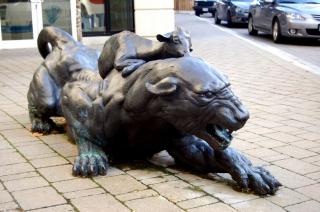
That sense of uncertainty—the work provoking emotionally and intellectually, but in an unpredictable and open-ended way—is very closely related to the reaction I had to Tom Dean’s Peaceable Kingdom. In the courtyard of the King Edward Village condo/retail development at the corner of Kingsway and Knight streets (surely the loudest intersection in the city), you will find a remarkable series of 22 life-scaled cast-bronze sculptures. A panther lies taut and snarling, ready to pounce as a kid goat licks its ear. A sow lies happily entwined with a python, while her piglets snooze nearby. A bear cub sits with a child, while three otters watch from near a waterfall. A crazed-looking beaver and his posse of rat friends peers at this tableau from around a corner, while above hangs a family of sloths, and high on one of the building’s upper ledges looms a vulture.
The impact of the work is intense and immediate. Casting in bronze is a complex nearly obsolete process, as project art consultant Lynne Werker points out in her Architecture BCarticle about the installation from April 2009. But it lends a gravity and permanence to the drama here that is deeply compelling. It contributes to the feeling that this work rises, as Werker says to me in a later interview, “to a more universal inquiry, a higher level set of oppositions.”
Those oppositions, and the uncertainty to which they contribute, charge the work with energy and give it focus. Standing in the courtyard—or more likely wandering back and forth, as the dynamic between the various animals, given physical geometry by the crisscrossing of their sightlines, draws you into motion—you’re aware of this work concealing as well as revealing. There is an unanswered question captured here. And even knowing that Dean had suggested in his proposal that he wanted to depict “serene beasts coexisting in a precarious sensual paradise,” and that he’d drawn on literary texts like Isaiah’s prophecy of a messianic age or Portia’s pronouncements on divine grace from The Merchant of Venice (as Werker explains to me), does nothing to remove or prematurely resolve the central tensions at play in the individual groupings, and between them. The panther is knotted with a repressed instinct to kill, but does not kill. Or not yet. The sow squirms, suffused in pleasure that the python could extinguish with one slow flex of his many coils. The bear listens to the benediction of the naked child, around whose shoulder his clawed left paw is casually thrown, lost in a train of thought that cannot quite be declared either hostile or benign. The otters are wary. The piglets unaware. The sloths infinitely patient. The beaver and the rats are scheming, but to what end? What is their plan here? What will be the outcome, as the vulture rustles his wings on the ledge of the building overhead, either settling into place or set to take wing, to darken the courtyard in his shadow, to signal his expectation of some imminent, bloody turning? There is peace in this Peaceable Kingdom, but only in the instant of our viewing. The future here is fragile. And the viewer (this viewer certainly) stands riveted, involved, implicated in some core and crucial human truth.
Tom Dean produced this work, it should be noted, for the Aquilini Investment Group. That is, he was working within that bureaucratic process mandated by the city. It involved a selection committee, facilitated by Werker, which included a representative from the developer. Aquilini could have gone into this process demanding that some detail of the neighborhood be teased out into an aesthetic motif useful in packaging the condo development for sale. But they selected Dean instead. And after receiving the commission, Werker describes Dean rigorously following his own vision. “He put his heart, mind and soul into this one,” she said, noting that three of the six animal groupings were not even in the original budget. He determined that these were needed and included them anyway, adding his own financial investment to the other things he had already committed to the project. Did he consider, I asked Werker, whether the future tenants of the building might think about the work?
She responds succinctly: “It’s not really in Tom’s process to wonder about that.”
Artist-driven. Brimming with idea and the suggestion of a concealed truth. No trace of mandate or message about it. Dean’s work succeeds magnificently by eluding the control of any process, any client, any bureaucratic method, by asserting itself and encouraging us likewise to react to it in our individual and spontaneous ways, born in the moment and impossible to anticipate.
Tom Dean’s work at King Edward Village is alive. And the viewer feels alive around it.
THREE: BRING BACK THE SPRING
After I learned about the Red Gate and talked to Jim Carrico, after I’d been introduced to Take5 and a number of other people, there followed a period of time when I enjoyed falling down the rabbit hole that is street art. And the deeper I went, the more I saw that inspired me. The more Rabbit came to life. What was it about this work that was so animating? I watched my new artist friends work and tried to figure it out.
I watched Byron Cameraman and Rich S put up one of their Orwell-inspired posters at Hastings and Main, at one in the morning on a cold Saturday in January. I watched the crowd gather and the ripple of excitement pass through them as the final words of the poster went up: Freedom is Slavery. I heard the cheer. People were cheering. A man yelled—in real life, as he does again in the pages of my book—“That is black and white, man! That is black and white!”
I watched A01 cover the DTES with his photocubic surfaces, pictures at 1:1 scale of urban textures, postered up directly over the objects they depicted. For a while they were invisible, hiding in perfect camouflage, as it were. Then they exploded to life, as A01 shifted his attentions from surfaces to flowers to people, the neighborhood excitedly beginning to realize that it had been the inspiration for and the very substance of this ongoing, obsessive street art project.
I watched JermIX put up his banners, annotations of the here and now. Comments on the everyday. On a bus shelter advert: Consumerisn’t. On a brick wall: You can’t always get what you want. Once, on a dumpster at the mouth of an alley leading east towards Main just off Cordova, a riddle, a warning: Don’t walk this Way. I saw that and found myself somehow precariously involved.
Then in late winter 2011, snow still on the ground, I went out again with Byron Cameraman. The book was just about to be published, so I was past research, just watching him do his work. Plus, Cameraman said, his friend Pete’s truck was in the shop and they needed help transporting the installation to its site.
I picked them up at the agreed place and helped them load 10 or 12 placards on long stakes, photos pasted to each side: colorful shots of foliage, leaves, lively flowers and green tree branches. Bring Back the Spring, it was called in total. So I drove them to the designated place, surprisingly enough in Shaughnessy, where I might not have expected Cameraman to make his contributions to the spontaneous civic art experience. But there we were, on The Crescent [is this the street’s formal name? It is, yes.], unloading the installation and carrying it to the very centre of the park, to a particularly high bush of rhododendrons, flanked by sapling maple trees, both stripped by the season and the cold, the lowering mist that made us glance around ourselves and shield our cameras, wondering if we were about to get soaked.
Cameraman went to work, positioning his photographs of spring in its details: the turn of a leaf, the curve of a blossom. Each placard positioned exactly in front of the detail that its photo depicted, remembered spring over living winter. And if you walked behind the installation, since the placards were two-sided with 180-degree opposing views, like magic you found yourself looking at the same tableau from the reverse angle: each sign a two-way window back to the spring behind us, suspended ethereal in the close and surrounding presence of winter’s now.
It was impossible not to imagine people wandering by the installation later and wondering about it. We talked a bit about that, although Cameraman, like Tom Dean, does not have it in his process to over-think these issues of public reaction. Responding to some impulse, his work gets made. But I could linger in the consideration because I was, at only one step closer to the source, one of those same reacting members of the public. Why was this work as animated to me as it was? The tableau was ambiguous, in the end. A glimpse of the past that suggested the future, but was it hope or was it a foreshadowing of winters to come, across time without measure, the endless return of night?
Cameraman didn’t volunteer readings, either way. His motives are obscure on every level, including why the work goes up in the first place—unpaid and, for the large part, unacknowledged. But that may be the strongest clue right there as to why his works affects people as I believe it does, involving them with a pull on the mind and the heart, with the suggestion of a riddle at the heart of human affairs. The ambiguity is the energy, freeing the work, releasing it from our control, opening our responses to the unpredictable, the spontaneous. People would come along, I knew—walking dogs, pushing strollers, jogging, holding hands, out in motorized wheelchairs—and they would wonder. And there was always the possibility of new life in wondering.
In the end, whether the Red Gate survives the next couple months or not, that is the question I think we have to ask ourselves about the art that grows around us, through official public-art programs and through the instructive chaos of street life: is the work alive? Because if it isn’t, how can it bring life to the city around it?