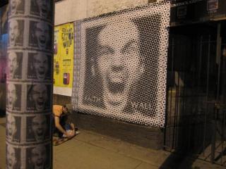
Faith Wall Camden Town?
Holy stickers Batman. These things have hit Toronto, New York, Halifax… everywhere.
Now they’ve reportedly crossed the pond. They’re going up in the UK now.
Move over Banksy. Or whatever. I have no idea what this means.
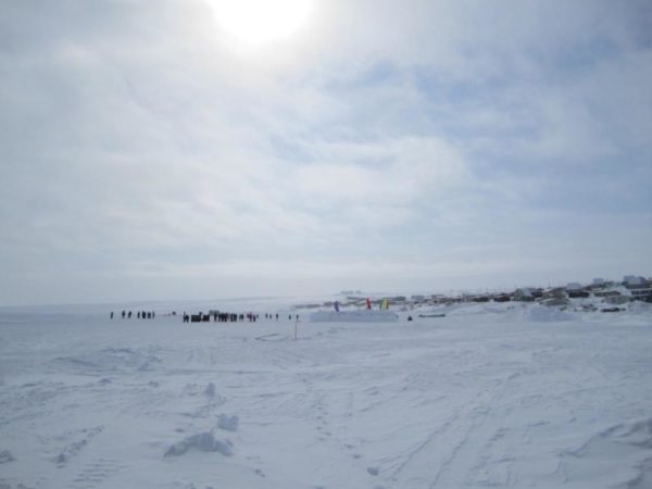
]]>In May I had to get back to work. That means magazine work. And that means travel. I still very much enjoy this aspect of my freelance life. This time around in particular, I had an unusual schedule that took me to Igloolik, in Nunuvut, which is in Canada’s arctic…
…and then to Dubai and Abu Dhabi, 9000 kilometers away in one of the hottest desert areas known to man.
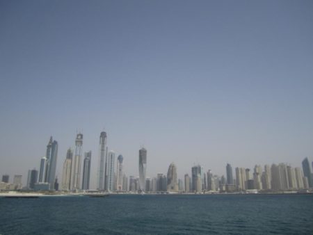
The experience generated plenty of stark contrasts, as you might imagine. -40 C versus +40 C is perhaps the most obvious. Ditto the landscapes of frozen snow and hot sand. But there’s also the area of wealth and development, where Dubai’s skyline seems to grow while you watch it and Igloolik is a clutch of low buildings along a remote stretch of beach in the Canadian high arctic. An international hub in the middle east versus an isolated hamlet in the frozen north. What two places could be more different?
And yet a couple of things struck me powerfully as being shared by these places. Both the Emiratis and the Inuit are ancient people, whose entrance into post-modernity has been relatively sudden. And in both places I was there to interview people whose lives are crucially connected to the project of staying in touch with ancient ways.
In the north, that person was Zacharius Kunuk, the legendary Inuit filmmaker who brought us the films The Fast Runner and The Journals of Knud Rassmussen.
Kunuk is a fascinating individual, whose committment to Inuit tradition comes paired with a fully post-modern engagement with technology and global thinking. I look forward to writing a profile of him and his work for an upcoming issue of Canadian Art.
In the United Arab Emirates, meanwhile, I was there to write several pieces that will run in Spafax Canada publications. But one of those assignments allowed me to meet Peter Bergh, one of the best known falconers in the world.

Falconry is a 2500 year old tradition in the middle east, and in a culture that isn’t easy to penetrate for western outsiders, it offers a fascinating window into the history of the region. I’ll be writing about Peter and the experience of working with his birds in an upcoming issue of Fairmont Magazine.
]]>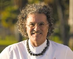
Chef Mavro, image from the James Beard Foundation
For the essay series Global is the New Local published in EnRoute Magazine in September, October and December 2010, I visited Hawaii and ate my way around the island of Oahu. One of the best meals, of the trip and probably my life so far, was had at Chef Mavro’s, where extremely high-end does not mean pretentious. And where I didn’t feel like keeling over after our eight course meal (like I did after eating what Tom Aikens had to offer, for example).
Here’s the transcript of our conversation, which touches on his idea about “regional”, the technical reasons his cuisine is so approachable and paradoxically light, as well as his creative process in creating a new menu item.
ON REGIONAL CUISINE
Chef Mavro: When I arrived in Hawaii it was just starting. You maybe know this story. When I arrived, many restaurants were doing “continental cuisine”. Mahi mahi with beurre blanc, even though Mahi Mahi wasn’t from here, it was frozen from Mexico. Everyone was doing a Caesar salad and a shrimp cocktail. But there were already a group of chefs Roy, Alan Wong, Sam Choy, and we say: we don’t do Caesar salad. So we created Hawaii Regional Cuisine. And we started of course to work with farmers who were doing specific ingredients just for us. Nalo farms was one of them.
But you know, all my life I have been doing only regional cuisine. In Provence I was maybe the first fine dining restaurant to do Provencal cuisine. “Gourmet” at that time meant French classics: buttery with cream. Provencal cuisine, 25 years ago, was considered too strong, too garlicky. Well… this is my roots. Provence. So even though my training was classic, I wanted to cook from my back yard, not from Burgundy and Alsace. I was still very modern, very nouvelle cuisine. My first rest Mavro in Marseille, I was bringing all the flavors of Provence in a very contemporary style. I was the only one to have a selection of wine from the Provencal terroire. I had close to 100 different wines, which at this time was “woah what’s going on?” But I thought if you’re cooking Provencal cuisine you have to serve the wine.
But I remember when I went to Los Angeles, I did the same thing. I had the same impression that I had in France. At this time everyone was talking about California nouvelle , but everyone was eating caesar salad and shrimp cocktail and chateaubriand. It was a nightmare for me. So I started cooking fresh Santa Barbara shrimp and produce from the valley. I was working with what I found.
I loved LA but for me, for a French cook, 24 years ago, LA was not the right place to be. I decided to move, so I went to Denver, where I was cooking Colorado cuisine. I was doing trout and venison and lamb.
I can only do this kind of cooking. It doesn’t make any sense to come to Hawaii and open a French restaurant and to cook Dover Sole. I has no sense. You cannot do something like that when you have all this wonderful fish in the ocean.
TECHNICAL APPROACHES
I don’t use stock and I don’t use demi-glace, I don’t work in traditional ways. To thicken a stock, I like to use vegetable. If I do a bordelaise, I use pinot noir and onions reduction. After that I smooth the sauce with a carrot puree, so my bordelaise has no butter, no oil. I also use celery root and fennel emulsion. Or cauliflower.
I’m cooking very light and flavorful. As soon as you cut the cream, I like it. I’ll use cream, but in a reduction, as soon as you cut the cream and butter suddenly you get to the pure flavor of your ingredients. You use some basil, then add cream, you lose 80 percent of the flavor. Instead of cream and butter, you use a puree of sweet onion, you multiply your basil by five. I like to make sure if you order a dish with basil, you taste the basil. People are making mistakes when they cook the basil. And if you cook it you lose it.
I think the contemporary way to approach the sauces is very important. What I like in molecular cuisine very much is the flavor extraction. Instead of butter and cream, you use gas. You suspend your flavor in air. I like that concept.
ON PULLING BACK FROM MOLECULAR TECHNIQUES
Molecular cuisine arrived in the US about 5 years ago. People began to talk about different restaurants, Alinea for example. But molecular techniques have been around since I started. Already Robouchon was using a canister to foam lagoustine. I remember I went there and I couldn’t understand it. Ferran Adria didn’t exist. And yes he’s now the master, and I like it.
But the more you go, the more you find out… you find out it’s nice because it’s light and flavorful and extracted… but it’s a lot of BS also, you understand? You learn that when you remove all the BS, there’s not much left. So of course you can impress people. In LA I was shocking people. And I don’t want you to come to my restaurant to be shocked.
So when I opened Chef Mavro, 10 years ago, I was foaming, clouding and bubbling, it was too much. It was extreme. We play, we have fun. But one day you think: what will be next? Let’s calm down a little bit. So if you go into the back, you’ll find a dozen gas canisters I don’t use any more.
We are still bubbling a salsa of fennel and lemongrass, and we do use the steam from the capucino, because I like very much the suspension of the flavors. And it looks like a bubble bath. So when I need it, I’ll use it. But it’s not the foundation of my cooking.
COMING TO HAWAII
You have to understand when I was in Denver I was cooking very traditional, but in my modern way. Lamb and venison. When the Halekulani (hotel) called me, I didn’t know much about Hawaii at all. They asked me to come in to take over La Mer. I was the chef in the restaurant when we got 5 stars from Michael Carter Denver Post, he was a big food writer, even if he was in Denver, he had a national following. Halekulani learned of this, so an owner came to spy, he came every night for a week. Then he called me. He said: I have a restaurant in Hawaii, it’s called La Mer. And I’d like you to take over. I said: why not?
Then I realized that the restaurant was in a hotel, and I declined. I’m sorry, I’m a free spirit. And I don’t want to deal with the BS of a hotel. So they sent me a pre-contract, with a price on it, and I said: well if you’re going to talk to me like that, I’ll change my mind.
CREATING A MAVRO RECIPE
OK, how do you create a recipe? Let’s start with Tamarind Roasted Sablefish. Number one, I don’t like too much farm raised fish. Someone comes with a farm raised fish and I’m not really interested, I prefer a fish from the wild. One day someone came with sable fish from the island. It comes from water 3000 feet, pure crystal water from very deep, so deep and so cold, that when they raise this fish from the ocean, they need to mix the water together to get the right temperature. So they mix with surface water to get 15 degrees, and they raise this beautiful sablefish. At first I say I’m not interested, I don’t do ground fish. But then I try. I find it’s very nice. Since they are young and small, there’s not too much oil. It’s delicious. It’s nothing more than a blackcod, or what you call butterfish in Japanese cuisine. But I knew I’m going to use it.
Since this is a black cod, we decided to do something that looks like misoyaki butterfish which is a classic. But this is not a Japanese restaurant, so we found our way to do it. I don’t use too much soy sauce, because it doesn’t work very well with the wine. So starting with the idea of this famous dish misoyaki butterfish, but we glaze with tamarind. And tamarind is very wine friendly, a little bit nutty. So, tamarind. And we use also like a sugar palm for the glaze. So this was the fish.
After that we did something very interesting. And this was Kevin’s idea. He was visiting France when he was with Le Cirque in New York. He went to the Basque country on vacation, and he discovered something I didn’t know existed. He discovered espelette. It’s a pimento, a red chili with a very specific flavor, a little spicy but not too much. And dry it’s like a powder, like paprika. So we flavor our puree maui onion, like a soubise, with espelette and it’s totally delicious. And since we didn’t want it to be a Japanese recipe even though it looks like a misoyaki, because we start with black cod, so we did it with a greek yoghurt with essence of cilantro emulsion, and we tossed the radish and cucumber and celery with this emulsion. And I think it’s a very interesting dish.
But we start with an ingredient, sometimes a spice, and we work around the spice. But here we work around the sable fish. And from the sable fish we arrived at the recipe. And we’re going to keep this for one more season. We’ve had it for one season, but now we still have all the ingredients with no problem. So we’ll do it again. But after that it will disappear and never come back.
HOW HE GOT INTO COOKING
My father was a Greek immigrant, came to France when he was 5 years old. He was French, he wasn’t Greek anymore. But the family was in the sponge business, they moved it to Tunisia. So at 5 he became French (when Tunisia became French). He went to Marseille to dive for coral. My grandfather died on the bottom on the sea, diving for coral. Lots of greek diving accidents. This was a classic way to die for a greek diver. So my father was in France, in Marseille. And he became an engineer. Since ancestry, and time in Tunisia, he was an outstanding home cook and my mother was terrible.
So since my youngest ages, I was maybe 6 or 7, I was cooking with him in the kitchen and doing all these things. Like cousouse, mousaka, mix of Greek and Tunisian and French. And he was very good. And he gave me the virus. And I was 16 when I decided I wanted to be a chef. He almost killed me. That is not a job. So I became an engineer.
I started my own business, but I decided this was not for me. I was working and making money. But I decided to sell my part of the business to my partner. So I had money, and I started from scratch. I realized that to be a home cook, I had a reputation, and people were in line to be invited to my house, but this had nothing to do with running a restaurant. You can be a great home cook and a lousy chef. I realized quickly there was no room for amateur. Sometimes customers will say: When I retire I’m going to open a restaurant. I say: good luck. It’s a crazy job for crazy people.
This is a job with one part savoir faire, one part talent. There is only one way to peel a carrot, there’s only one way to cook a carrot. After that you can be creative. And I’m still not up to my expectation. I’m not done yet. I’m surrounded by very talented young chefs who keep me on my toes. And we work as a team.
I enjoy my food though, and this is new. I’ve startedto be quite happy with what we’re producing.
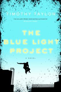
cover by Scott Richardson
The Canadian cover of my new novel has been finalized. Scott Richardson is the designer and I think he’s done a great job. The flying man is doing a parkour stunt. Wonder what he’s running from? I bet it’s really tense. I bet there’s danger involved.
I’d buy it. Of course, I am biased.
]]>
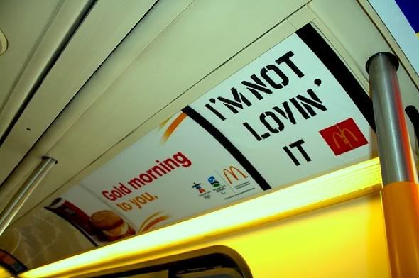
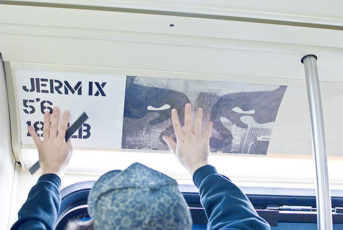
Image courtesy JermIX
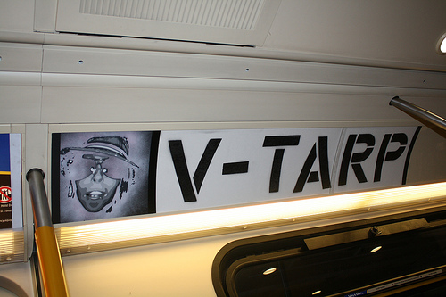
So Banksy declares street art dead and apparently nobody was listening. JermIX certainly wasn’t. Working with UK import Vegas – a stencil artist of remarkable skill – Jerm has launched what many consider his most aggressive campaign ever. VTARP, it’s called. Vancouver Transit Adspace Reappropriation Project. Which sounds like a black line item in the DND budget. But which is actually a guerilla program involving dozens of artists who are putting up art on public transit vehicles in empty ad space.
That’s right. The white space between McDonalds and VanCity ads is being filled with art. And Translink is greatly annoyed, although also a bit impressed judging from their very formal, though very cordial letter sent to the two organizing artists.
Of course it’s easy to see why Translink is concerned. Some of the art in question takes open shots at advertisers. Although seriously, making fun of McDonalds is not the edgiest criticism Translink management has ever encountered, one would hope.

Nevertheless, it is this business of confronting advertisers that clearly has Translink most upset. In the letter to the artists, the unnamed Translink manager (unnamed, that is, as a courtesy extended by Jerm and Vegas in their publicizing of the letter) complains that VTARP is actually hurting revenues.
The letter reads in part:
So while the issues you raise in V-TARP are important, your project is sadly affecting a key funding source to make its point. By taking over our ad space and posting works that criticize our ads, V-TARP is creating a negative impact on TransLink’s relationship with advertisers, which is starting to cost our system in revenue.
As hard as it is to believe that the McDonald’s of the world are pulling out of advertising on Translink as a result of VTARP, it still leaves the artists with a question to answer. Continue and potentially face charges or a civil suit? Or, do as Translink is demanding, that is, cease and desist. In fairness, Translink is also suggesting (without commitment, of course) that they will consider an art-on-the-trains type program for the future, and have expressed an interest in working with Jerm and Vegas.
As I’ve written to Jerm separately, I hope that they continue. Only I also hope they can avoid the charge that they’re causing damage by keeping the artwork non-specific in its editorial tone. If taking a criticism of McDonald’s off the table is their only concession, seems like the cost/benefit analysis might play out positive.
But is the experience of a Translink customer improved by this work? Is the city itself improved? It’s a matter of opinion, but I vote yes.
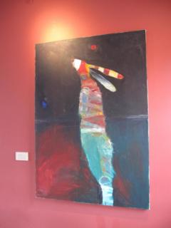
Rabbit painting by Cody Bustamante hanging at Scott Paul Winery
On a gig for Western Living Magazine, I toured the Willamette Valley recently. Lots of gems to discover there, like Whole Hog Wednesdays at the Dundee Bistro. And of course several hundred small, high-craft wineries that produce the amazing fruity, farmy pinot noirs of the region.
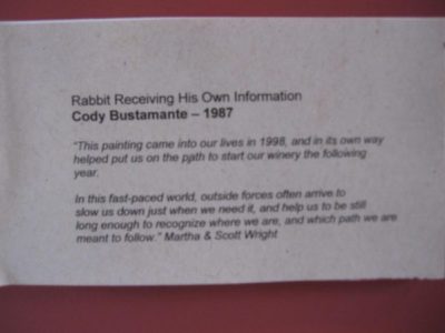
But I particularly enjoyed “meeting” the mascot of the Scott Paul Winery. He’s a rabbit. And the painting of him, which Scott Paul used to inspire the rabbit on their label, is by Oregon artist Cody Bustamante. The painting is called “Rabbit Receiving his own Information”, and it shows the animal with his head cocked to the sky, as if listening to a timely bit of advice.
The story behind the painting is a good one.
Scott Paul is the brainchild of former big-time disc jockey Shadow Stevens, whose real name is Scott Paul Wright. After a career in radio, Wright went to work for Epic Records. The work situation there was reportedly very stressful (maybe in part because Wright was involved in such culturally dubious projects as launching the career of Brittney Spears). In any case, Wright became sick. And around this time, a friend sold him the painting “Rabbit Receiving his own Information”.
The friend also told Wright the story behind the painting. The Rabbit is illustrating a life lesson: that people are occasionally stopped short by illness only to find that the resulting inactivity allows them to really listen for the first time and here their “own information”. From that information, then, can come about great change.
In Wright’s case, the change was a decision to turn away from the corporate music world and start Scott Paul Winery. He and his wife moved to Oregon. On arrival they made a final discovery, closing the loop on this story. They learned that the artist who painted this important work lived in the area.
Rabbit had come home. And so, in effect, had Wright.
Some people might find this whole idea of one’s “own information” as a bit flakey,or new aged. But I find it very appealing and hopeful. And the story of Wright had within it a strange parallel for me. That’s because – having never heard this story previously – I had named the main character of my new novel The Blue Light Project “Rabbit”. And my Rabbit too is touched all at once – while he was suffering from stress related illness, no less – by his “own information”. And in his case, it was also life changing.
Here’s to having the time to here our “own information”.
]]>
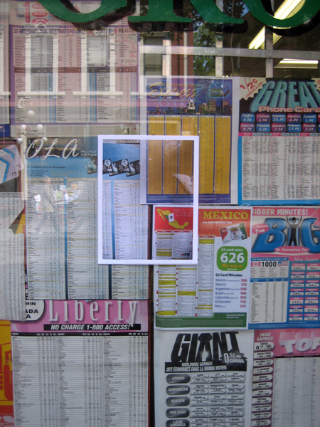
A01 Local Photo Poster
A01 is one of the artists I followed around during the writing of my new novel The Blue Light Project. His work impressed me hugely in a number of different ways. The first and most obvious way related simply to how prolific he was. The photo above is from a series called Local Photo Posters. At the time I met him, he estimated he’d put up 200 of these in Vancouver and was plannng 300 more. He has since done a similar series in Toronto, although I don’t have pictures of any of those.
Some of these photos are from A01’s website, by the way, which you should check out. He’s an artist of super-charged intensity and complex idea.
Andrew’s Local Photo Posters are 1:1 posters that are put up directly on top of the surfaces they depict: urban distress, textures that A01 found interesting. (Can you figure out how he took the picture at perfect 1:1 ratio, by the way. It does not involve blowing up or shrinking the image in photo shop. It involves snapping the picture at the right distance from the object. Try it yourself. It’s almost impossible to do perfect 1:1 unless you know the trick.)
In any case, for awhile there, in late 2007 and early2008, these photo posters became one of the defining features of the Gastown/Downtown Eastside neighborhoods. They really exploded around the neighborhood and suddenly people were seeing them everywhere.
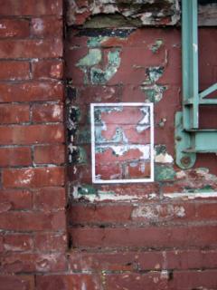
Sometimes they were hard to spot, like this one in the middle of a bulletin board.
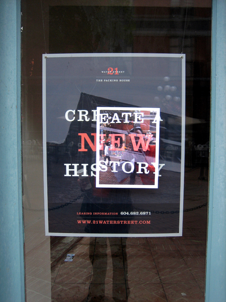
And here’s another one that went up over the advertisement on the window of a store:
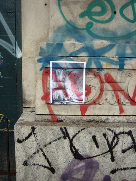
Or this one, a personal favorite, over calling card adverts:
Part of what interested me about this work was the way A01 used the neighborhood as its own material. He was showing the neighborhood back to itself. The DTES is often described in the press merely by its low income and poverty figures. In A01’s world it is the source of its own beauty.
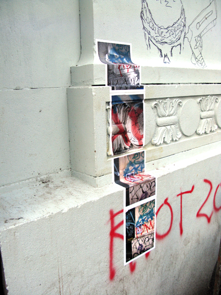
As I watched all this work go up – note how above A01 has moved to a four part construction – what I noticed was how the work seemed to have a catalytic effect. People noticed it. Street artists talked about the work online, in the places where they gathered and compared photos. There was a lot of work out there and a lot of discussion going on. And I think that kind of fed interest in the scene around this time.
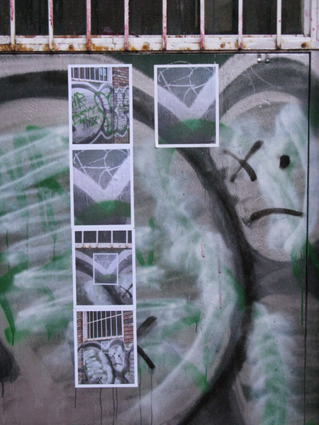
Here are some Andrew postered up over graffiti. This is an interesting one, because here he’s put up his photographs of graffiti over a wall where the graffiti has already been scrubbed or removed with white paint. So A01’s photos are showing you a snapshot from the wall’s past.
Andrew conveyed to me a real urgency and energy which seemed very fresh to me. It suggested kind of the degree to which people were gripped by this project that is invisible to so many people. Street art is this thing that people do, and rarely do people thank them for it. Quite the contrary they’re frequently prosecuted for it. And since the work couldn’t be easily explained in those common ways that we explain things nowadays, in terms of profit motive or the drive for real reputation and fame, there didn’t seem to be much calculation in it, and this lent a kind of attractive mystery to the work.
I’ll post more about Andrew Owen in the coming months. This is only a fragment of his remarkable output.
But in the meantime: thanks A01.
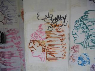
Take5 Chief’s Head – Contact the artist for prints at [email protected]
There were many more than the map shows, but this reflects my dawning awareness that right in the streets around my building, there was this artistic project going on.
Another thing that Take5 introduced me to, for the first time, was the idea of street art as a dialogue. That’s a polite way to put it really. All art is a dialogue in the sense that artists make reference to one another, to their influences in history and their contemporaries. But it’s rare in gallery art for artists to go into a gallery and actually start adding brush strokes to an original painting.
In street art it’s very common, as in the above example, where someone has added a thought-bubble to Take5’s Chief’s Head, turning it into political art.
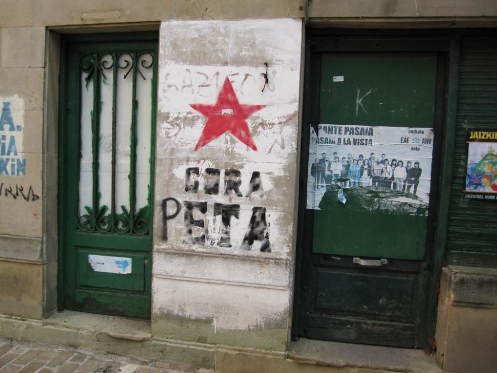
To digress slightly, this dynamic can work the other way, as well. Here is piece of political art that has been altered to turn it into a different kind of political art. Here “ETA”, the separatist Basqe organizatin, becomes “PETA”.
This is not Take5 related, as I found this piece in Spain.
To return to Take5, it was important to see his work in Vancouver for the first time, as I was writing The Blue Light Project, not only to appreciate the dialogue that street art could be, and also to see the activity of a single artist, something that helped me first conceive of my street art character Rabbit.
It was also important for me to first realize the impact that the obsessions of a single artist could have on a street, a blank wall, the routine of another day.
Like many street artists that I was going to meet later, Take5’s work had the effect of stopping you, bringing you up short, breaking routine. We forget so much of what we do every day, all the grained in motions and transactions. I never forgot seeing something like this for the first time.
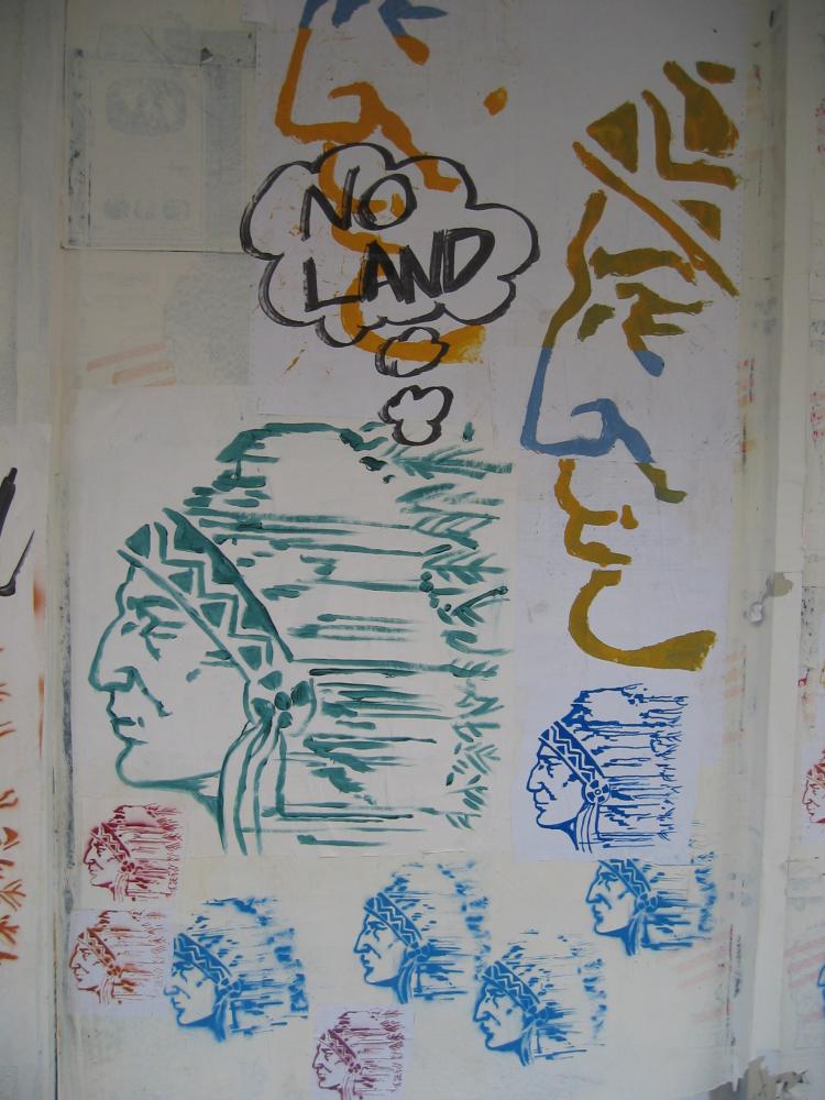
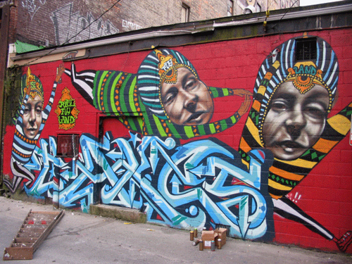
Rise Fly Land, it’s called. A piece by Take5 and Other. For a long time I thought I was writing a novel that would be called “Rise Fly Land”, in fact. Although the title changed, the influence of seeing Take5’s work stayed in the book.
If you like this work, consider contacting Take for a print at [email protected]
]]> Sometimes your notebooks surprise you. Here I discover that my character Trout (a kid) from my novel Stanley Park, was originally conceived as a Manchester United fan.
The horror.
Bear in mind this was written in 1996, just months before I discovered my admiration for the elegance and sophistication of the Chelsea Football Club.
But that’s not the point really. The point is that in notebooks, characters come to life in ways that even their creators can’t quite anticipate. And that makes them oddly more lifelike. They defy expectations. They behave, suddenly, a lot more like your own real friends.
Trout, who had suffered from Kawasaki’s disease, and ensuing heart complications, wanted to play soccer. His parents, understandably, were worried and protective. I’d forgotten that whole dynamic.
I’d also forgotten that Trout was an artistic kid. The empty glass wall Jeremy notices in this passage is where Trout had previously pasted up a big work of art, long gone from the manuscript. It looked like this:

At the time my manuscript was submitted, I recall my then-agent Dean Cooke writing to me and saying: “I hate the money tree. It’s too overtly symbolic.”
He was right. So we lost the money tree. And so this scene, in which Jeremy looks at an empty window where the non-existent money tree had been, makes reference to an idea that never made the final page. But it still leaves me wondering how things turned out. What happened to Trout’s artistic impulse? What happened to his desire to play soccer?
And I guess that curiosity explains why I’m now exploring what happened to these characters over the following years.
]]>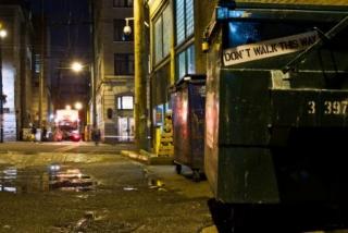
JermIX: Don’t Walk This Way (Photo by Byron Dauncey)
JermIX is one of the artists that inspired me during the writing of my new novel, The Blue Light Project. It’s possible to know about JermIX (aka Jerm, aka Jerm9ine) and not even realize you know about him. That’s because he is one of the most prolific and dedicated street artists I’ve encountered. I’ll be posting lots more about him and other street artists over the next months, but for now, just check out this image.
This beautiful shot was taken by Bryon Cameraman, but it captures a lot of what I admire about Jerm’s work. I sorta think of him as an annotation engine. He looks at the world and comments on it, but in a physical, on-site way. He’s like a walking breathing pop-up video. And he stops you in your tracks sometimes. Which is a rare phenomenon in our rushed and overly scheduled lives.
I think that exact quality is what arrested me about him, and opened up a window into the universe of street art. It’s difficult to explain exactly *why* Jerm does what he does. I mean, where does this phenomenon come from exactly? When I share more photos of his work, perhaps you’ll find yourself asking the same question. There is a ton of Jerm art out there on the streets fo Vancouver, a ton of hours spent postering and riding trains and doing all the crazy stuff that Jerm does. Is it about money? Well that seems doubtful. Fame? Maybe, although even if the Wooster Collective publishes a Jerm picture from time to time (which is a huge kudo in street art), the result is not exactly fame in the conventional sense of it.
It’s a bit of a mystery, in other words. And asking Jerm doesn’t entirely clear up the mystery either. But I think that’s exactly what makes the work powerful. It seems to respond to some inner urgency. And in a world that is highly programmed to understand everything in terms of profit and personal agendas of advancement (and novelists are certainly guilty of this too) I think it’s kind of encouraging to be reminded occasionally that there are mysteries left.
Stay tuned for more posts of Jerm’s work, as well as many other artists who I’ve come to admire.
]]>